Covers
Among the many things I have worked on since returning to the world of writing, illustrating has proved to be just as challenging as crafting the story itself. I usually begin with the cover art then go from one chapter to another, visualizing the scene as a whole and freezing each mental image I find until I have one I think would be good to work on.
When I started my first book, I used one image and kept it as the primary for every chapter. After a couple of books under my belt, I decided I wanted to see more. I felt it was just as important to have a chapter illustration as it was to have the cover image for the book.
Now, when I have a book idea, I work on the cover for weeks, assembling sketches and putting together graphics that fit what I envision for the story.
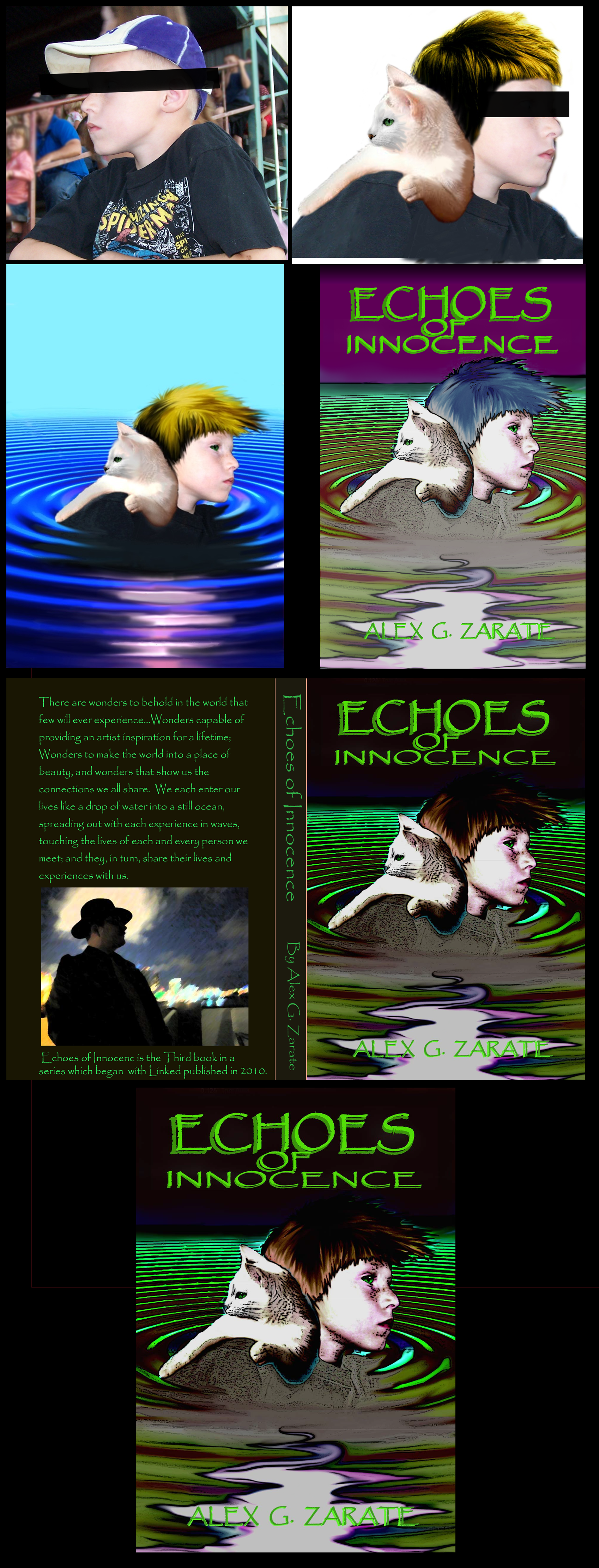
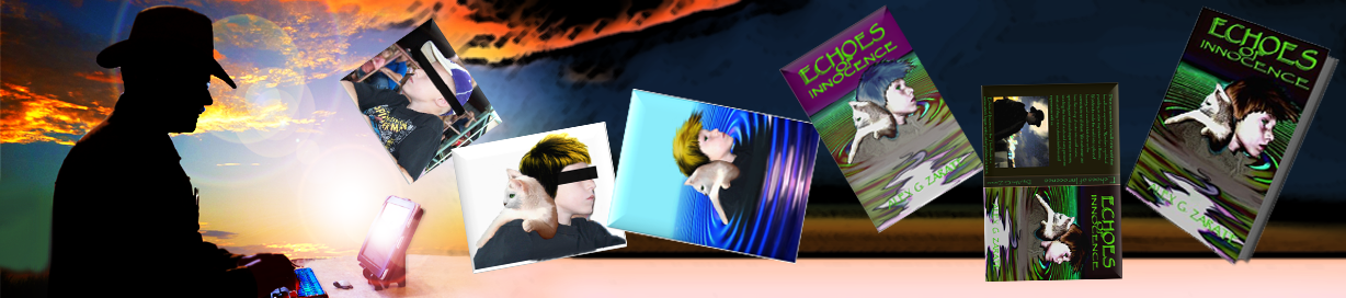
As an example, when I started writing my fourth book, Echoes of Innocence, I knew I wanted to have Tommy and Snowy on the cover facing opposite directions. The story leads them on different paths and I wanted a subtle indication for the reader. In the story, Tommy is distraught over the death of his friend and neighbor while Snowy is doing what he can to save a girl who accompanied the killer. In many ways, they are still together, but for the most part, they are seeing the world from a different perspective. With that in mind, here is how I tackled the cover design:
I always start the process of making my cover art with sketch ideas. Post-its work well for this because when I don’t care for a sketch, I can drop it and add another in its place. By the end, I have a handful of mini-sketches to work with.
Once I decide on one, I start working out how to make it into a cover. I don’t like to make illustrations that look photo-realistic. In my mind, covers that look too real remind me of romance novels. (Egad!)
Next, I find images that fit my idea. Usually I go into my archived pix folder to find something I can use. I take pictures of everything and often have what I need if I keep looking. Sadly, for Echoes, I fell short. The ripple on the ground was easy. Photoshop has tons of ways I can make ripples. There are even online tutorials that show how to do cool effects with colors and texture. Thanks, YouTube!
The problem I had was twofold. I did have the cat face I needed, (Yay!) but the cat’s body wasn’t in the correct position. I finally found an online video of a cat facing the wrong direction, but in the right position. (Well, as close as I could get) I captured the image, flipped it around then warped the body to the position I needed. Next, I put on the face I had and called it done.
The next problem was Tommy. I didn’t have an image of a boy in my archives. I have friends and sunsets, flowers and landscapes, but no pre-teen boys. Searching the internet didn’t do me any favors either. All images were either copy written or not in profile. The solution came from a friend of mine who had family pictures of her grandkids. One was facing to one side in a perfect profile. The wrong direction, sure, but Photoshop makes light work of that.
Since he was wearing a baseball cap, I deleted it and created hair. I copied the cat’s eyes and added them to the new Tommy. From here, I began the blending process for each section. His hair needed a little lengthening, so I added a few strokes. By the end, the cat’s face looked as if it belonged with the body I assembled. The hair and position of Tommy also looked well. His eyes were just right and the ripples at the bottom had the effect I wanted.
All that was left was the title and my name at the bottom.
Finally, I copied it onto the pdf book template and that was that. Huzzah! Cover be done!